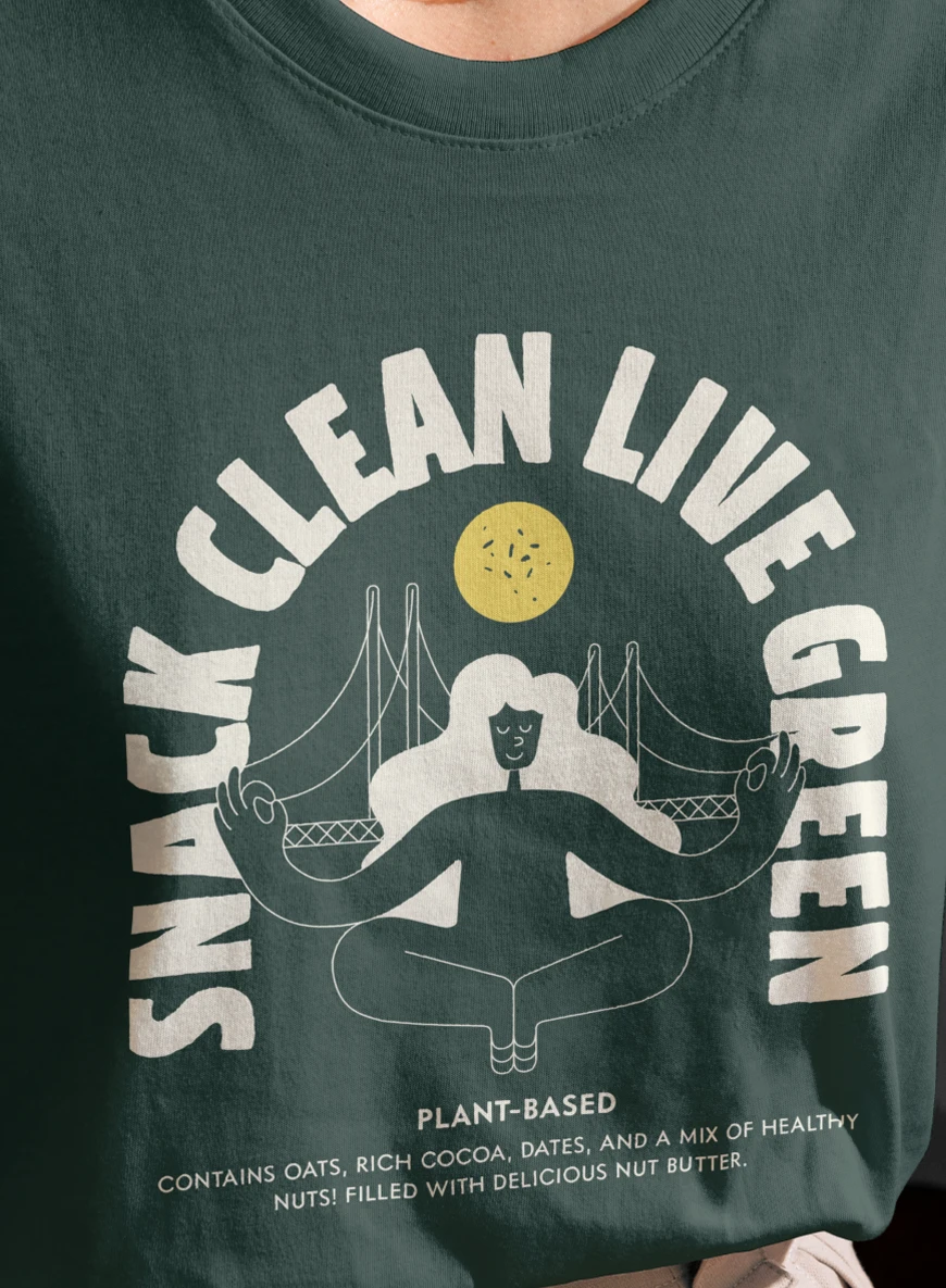
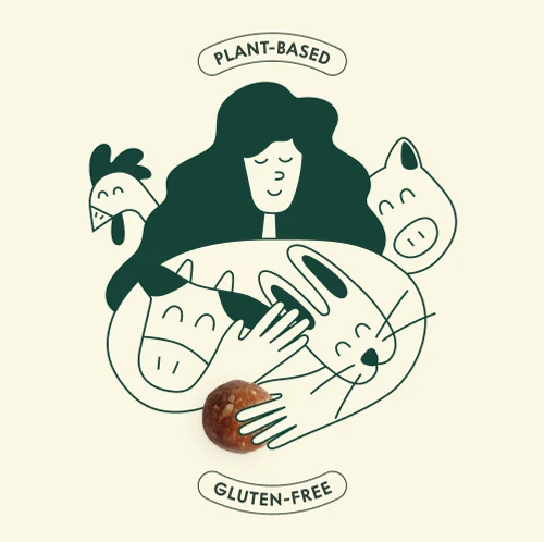
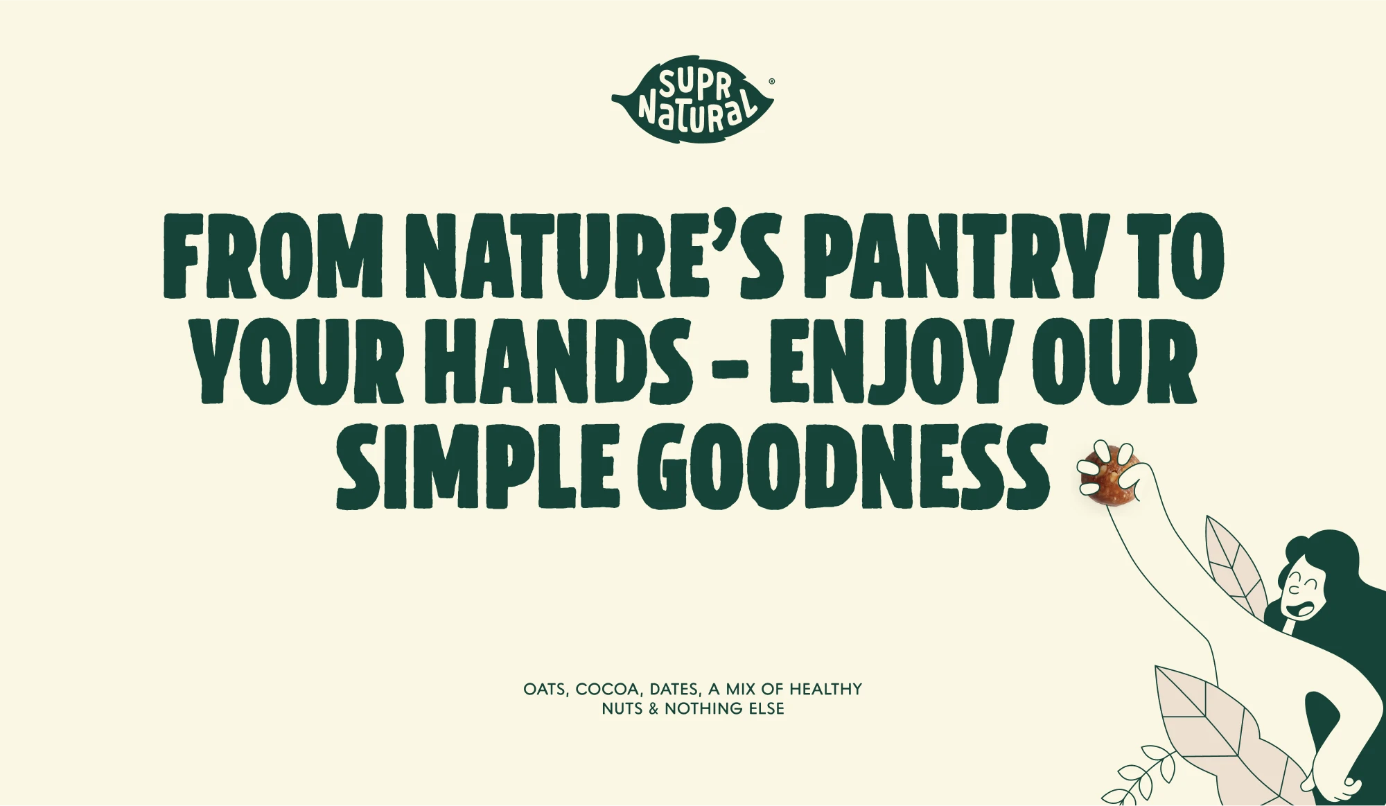
We were entrusted with a rebranding challenge: to create an identity and packaging system that distances the brand from typical processed snacks, and instead craft a unique, handmade identity that resonates with health-conscious consumers. By using warm tones, rough illustrations, and a friendly voice, we stroke balance between ‘handmade’ and ‘modern’, with the goal to develop a vibrant and contemporary visual language while celebrating the brand’s organic roots.
The Packaging
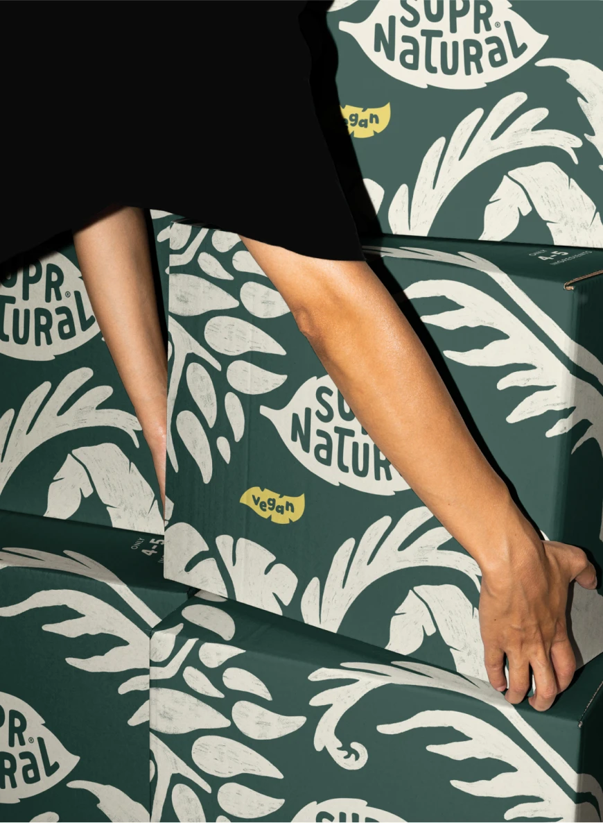
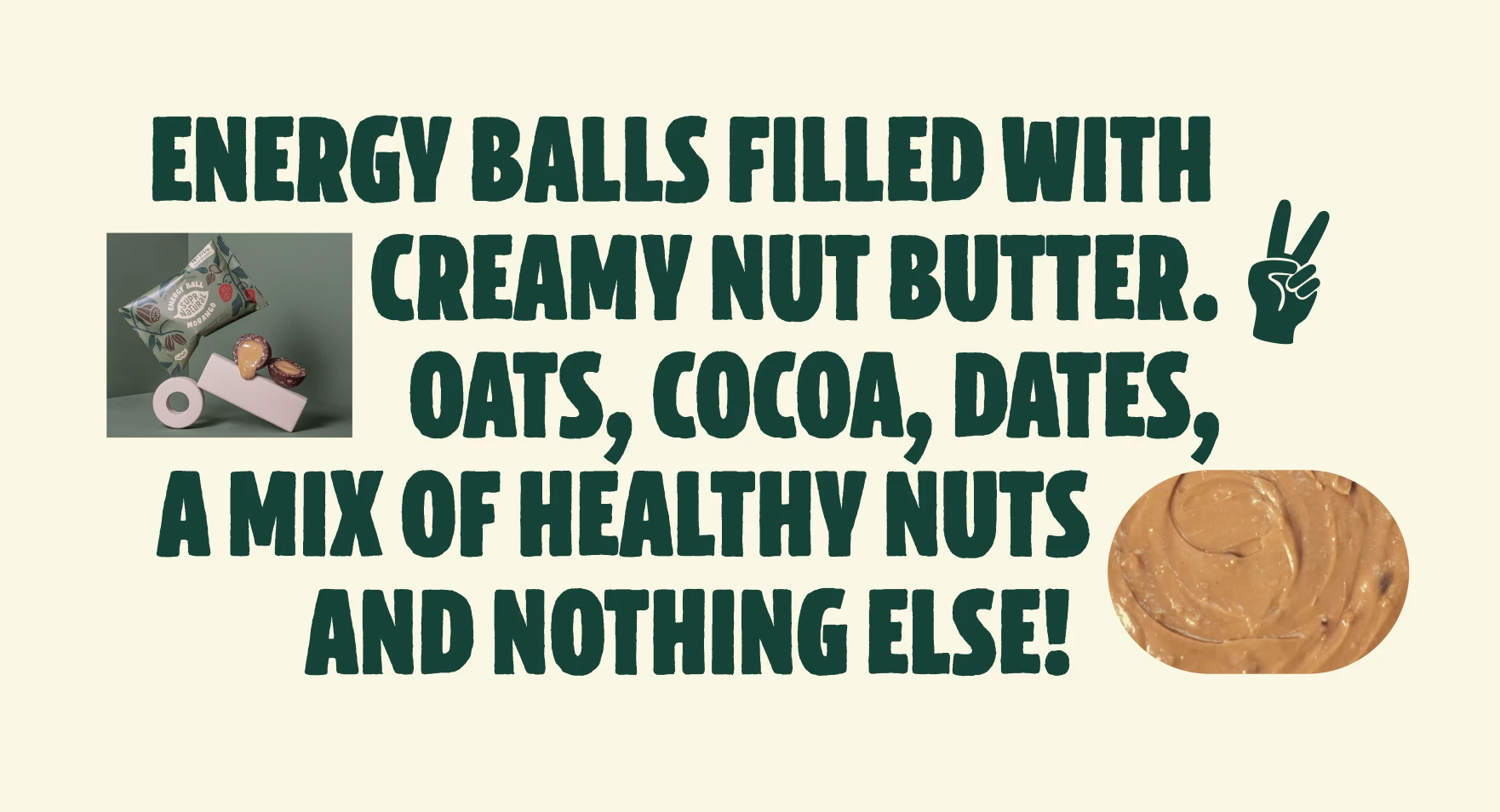
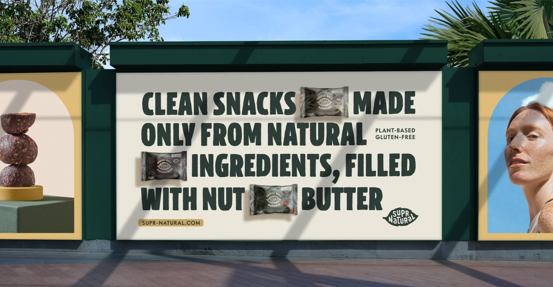
Supr Natural’s packaging exudes a warm and organic aesthetic. We crated an extensive set of modular, hand-drawn illustrations, so that whenever a new flavor was added to the range, new packaging could be created with ease.
Hand-drawings of the main ingredients highlight the product’s origins and reinforce the brand’s authentic and handcrafted feel.

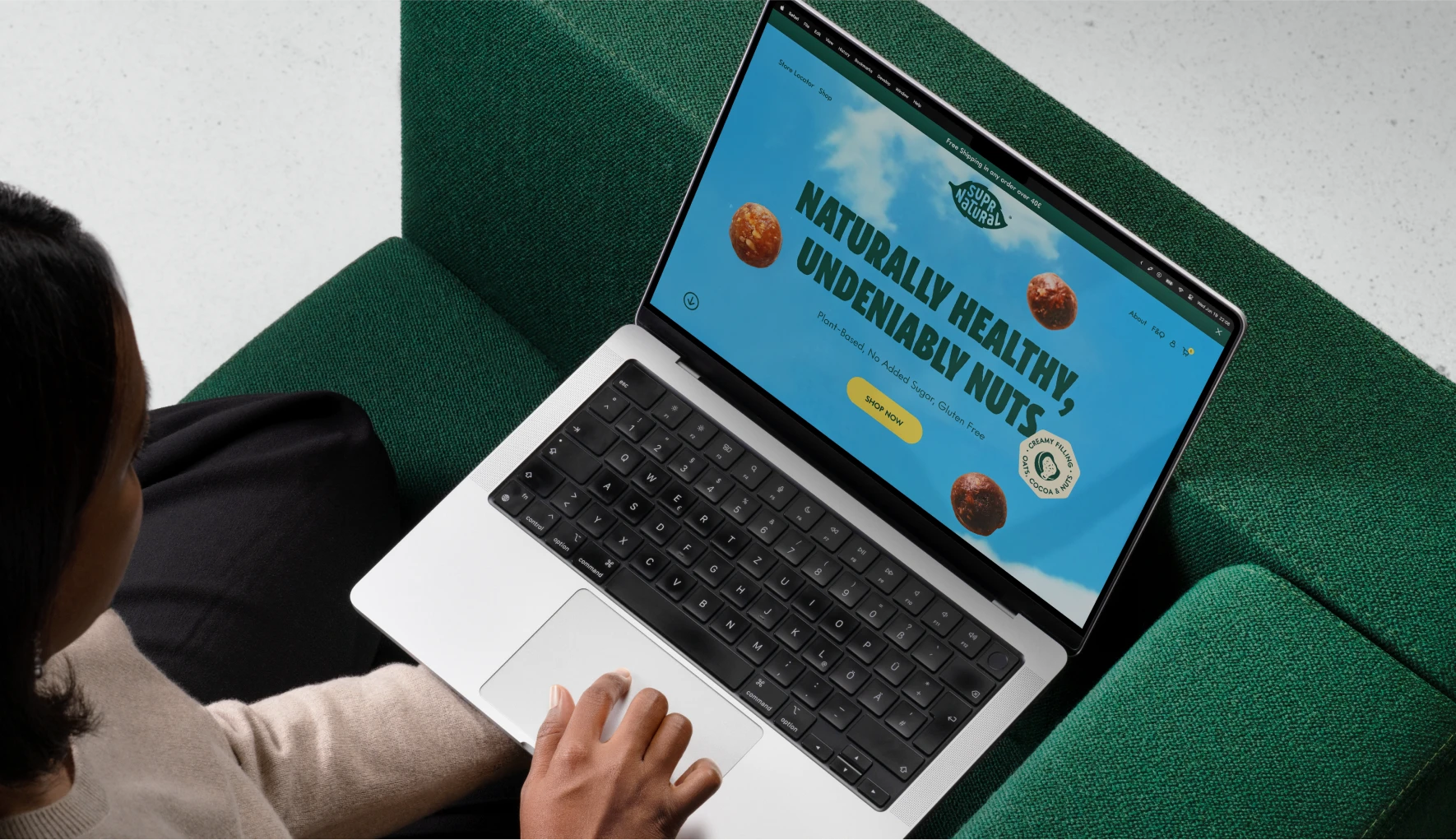
To reach a wider European audience, we developed an online store that made ordering a breeze. With full creative oversight of the entire project – from digital strategy to product delivery – we were able to create a seamless and enjoyable shopping experience for customers, that reflected the brand’s commitment to health and authenticity at every step.
